Identity foundation / August 2026
Built to be seen.
Easy to use.
This guide captures the complete Walkie One identity as it stands today: the static master artwork, perforated orb construction, custom split-weight wordmark, typography, surfaces, motion, and the rules that keep every use unmistakable.
CORE MARK LOCKEDSTATIC MASTER 08B OPTICAL BALANCEWORDMARK FONT INTER VARIABLE 770 / 420ORB 08 DISTINCTIVE
PRIMARY IDENTITY / CARBON
01 / PRIMARY IDENTITYOne lockup.
One lockup.
Two surfaces.
The orb and wordmark together form the primary identity. Use this complete horizontal lockup whenever space allows.
02 / STATIC SYSTEMThe system
The system
comes apart.
The orb and wordmark can work independently, but they have different jobs. Do not rebuild the full lockup by manually placing these pieces.

02A / ORB
The recognizer.
Use alone for avatars, favicons, social icons, app tiles, stamps, grill badges, and compact spaces where the brand is already understood.

02B / WORDMARK
The name.
Use alone in highly horizontal spaces, editorial mastheads, sponsorship rows, and applications where the orb is shown elsewhere nearby.

ARTWORK CANVAS1600 × 500
Native SVG coordinate system for the supplied horizontal lockup.
ORB DIAMETER400 UNITS
The 1000-unit master orb is placed at 40% scale in the lockup.
OPTICAL GAP54 UNITS
Measured from the orb boundary to the wordmark start—not a generic space character.
WORDMARK STARTX 486 / BASELINE 312
Locked optical position in the 1600 × 500 master.
Reference only. These measurements explain the approved artwork; they are not instructions to rebuild it. Always place the supplied SVG.
PAPER MASTER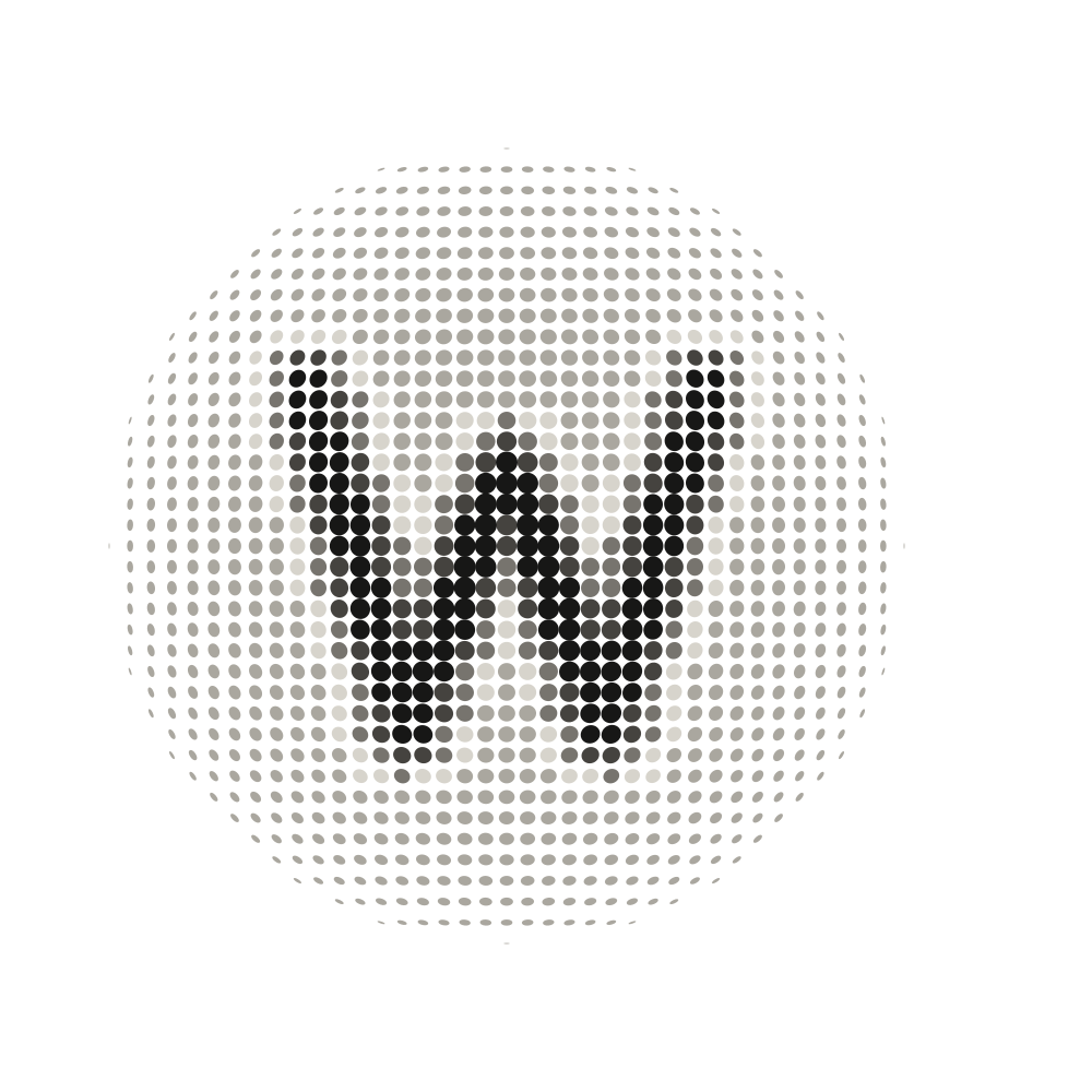
FIELD
#AAA79FHALO
#D7D4CCSOFT W
#77746ESTRONG W
#45433FCORE W
#171716CARBON REVERSE
FIELD
#3B3A37HALO
#242422SOFT W
#5F5D58STRONG W
#8B8881CORE W
#BBB6ACThe W is revealed through tonal hierarchy inside the same uninterrupted perforation field. It is never an overlaid letter, knockout, mask, or missing-dot shape.
03 / TYPOGRAPHYThe name has
The name has
two voices.
The logo wordmark and the supporting brand typography are related but not interchangeable. Inter Variable creates the final split-weight wordmark. Geist carries the website, specifications, and everyday communication.
WALKIEONE
WALKIEWEIGHT 770
TRACKING −4 / −0.0317EMONEWEIGHT 420
TRACKING −1 / −0.0079EMOPTICAL SEPARATION30 SOURCE UNITS
0.238EM AT MASTER SIZEMASTER TYPE SIZE126 UNITS
SVG LIVE TEXT + EMBEDDED FONTImportant
The supplied wordmark SVG embeds its own Inter font data and exact settings. Use that master for production; do not type “WALKIE ONE” in ordinary Inter and assume it is the logo.
A clear signal.
Headlines, body copy, interfaces, presentations, and general brand communication.
CHANNEL 01 / ACTIVE
Labels, specifications, captions, navigation, asset names, and technical metadata.
Human, not sterile.
A restrained editorial contrast for selected headline phrases only. Never use it inside the logo.
04 / COLOUR & SURFACESStart with
Start with
contrast.
Mineral Carbon is the baseline brand colour. Paper provides warmth without looking cream. The neutral pair should carry most everyday applications.
MINERAL CARBON
#171716Primary background, wordmark on light surfaces, premium packaging, signage.
PAPER
#F2F0E9Primary light surface and the preferred reverse mark colour on Carbon.
WARM WHITE
#E9E5DCSecondary reverse tone for large applications and softer contrast.
SIGNAL NEUTRAL
#8D8981Supporting labels, captions, dividers, and secondary information only.
Working rule
Use Carbon and Paper first. Introduce expressive colour as an accent or campaign layer—not as a replacement for the everyday master identity.
05 / SPACING & SIZEGive the signal
Give the signal
room to resolve.
The perforated orb needs more breathing room than a flat symbol. Protect its edge and avoid shrinking the detail beyond recognition.
¼D¼D
Keep at least one quarter of the orb’s diameter clear on every side of the complete lockup.
240 PXFull lockup48 PXStandalone orb
Below 48 px, use the optimized favicon export rather than shrinking the general orb asset.
06 / USAGEKeep it
Keep it
recognizable.
The mark gets its character from the exact dot field, W shading, spacing, and split-weight wordmark. Those relationships should never be recreated by eye.
- Use the supplied master artwork.
- Choose the version designed for the surface.
- Maintain the original proportions and spacing.
- Keep the surrounding area quiet and high-contrast.
- Use the orb alone only when brand recognition is established.
- Stretch, condense, rotate, or skew the mark.
- Retype or approximate the wordmark.
- Move the orb closer to the wordmark.
- Recolour individual dots in the core identity.
- Place the mark over noisy imagery without a quiet field.
DO NOT distort the proportions.
DO NOT use insufficient contrast.
DO NOT rotate the lockup.
DO NOT add glow or effects.
07 / EXPRESSIVE LAYERTurn up the signal
Turn up the signal
when it matters.
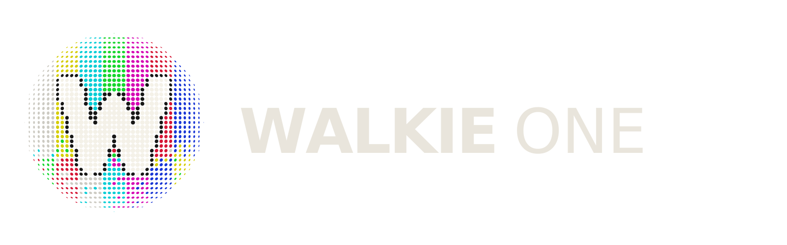
The broadcast-bar orb is a secondary expression for campaigns, launches, social content, special editions, and motion. It should not replace the Mineral Carbon master in everyday brand use.
PROVISIONAL EXPRESSIVE MARK / CARBON MOAT