Direct Carve
SOLID W / NO BUFFER
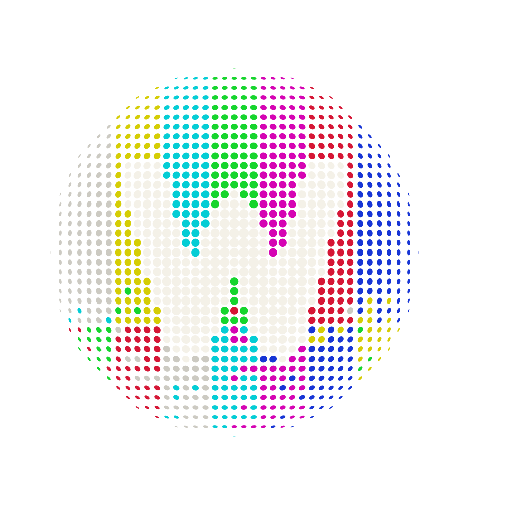
Final selection / 08B + Distinctive Orb
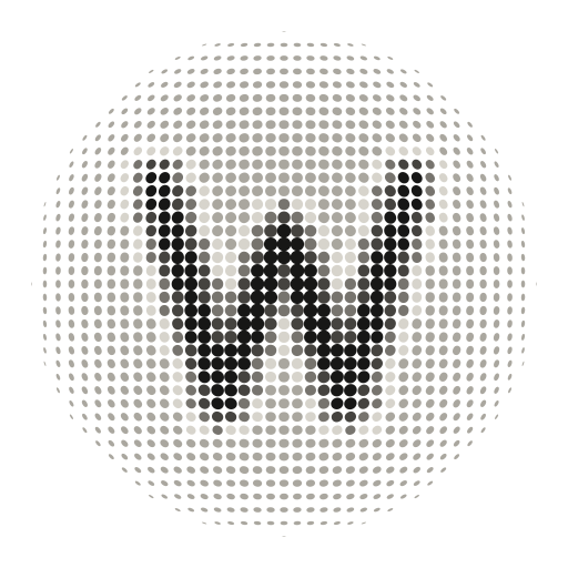
Optical Balance is the final lockup: Split Weight typography, corrected spacing, and the more expressive Distinctive orb. Mineral Carbon remains the primary brand version.
Precision study / zero colour bleed
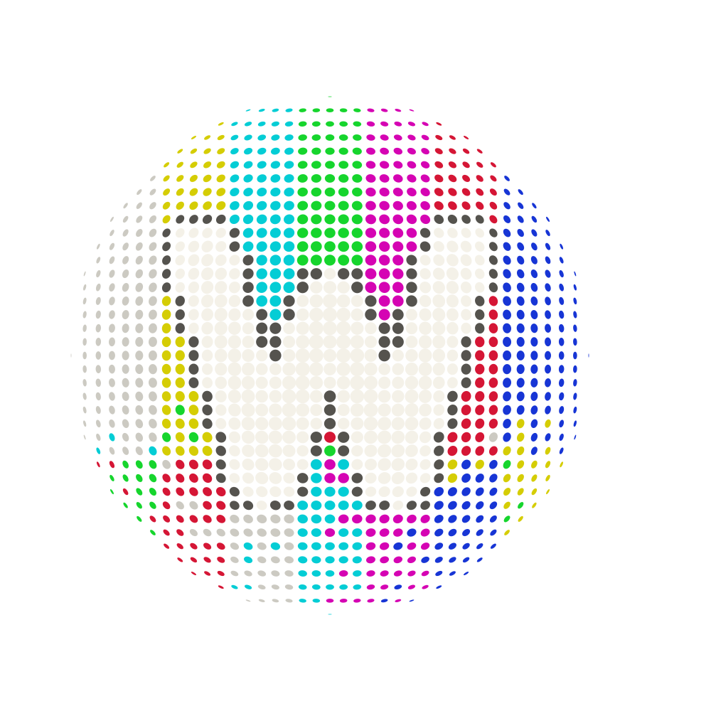
Every perforation forming the W is exactly the same solid colour. Broadcast bars never enter it, tint it, interrupt it, or soften its edge.
The only variable is the separation immediately outside the W.
SOLID W / NO BUFFER
SOLID W / CARBON BUFFER
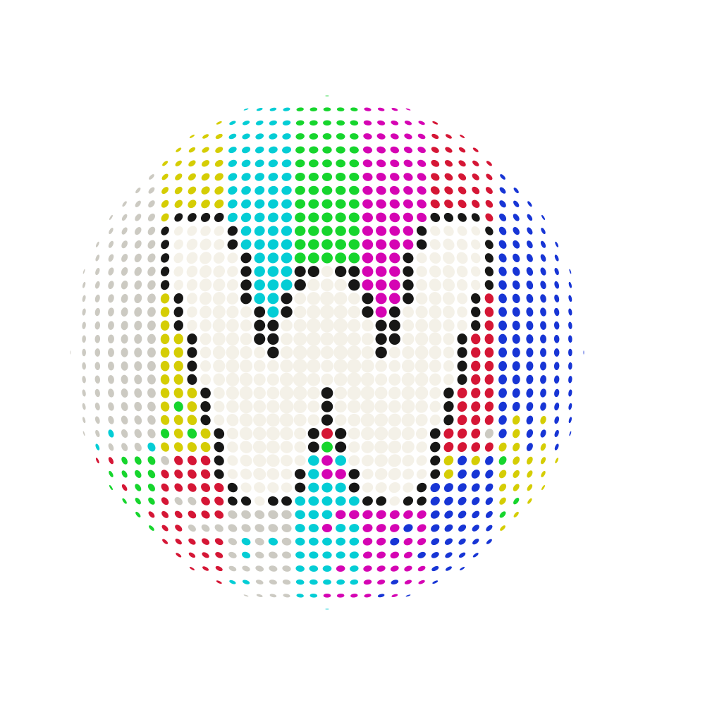
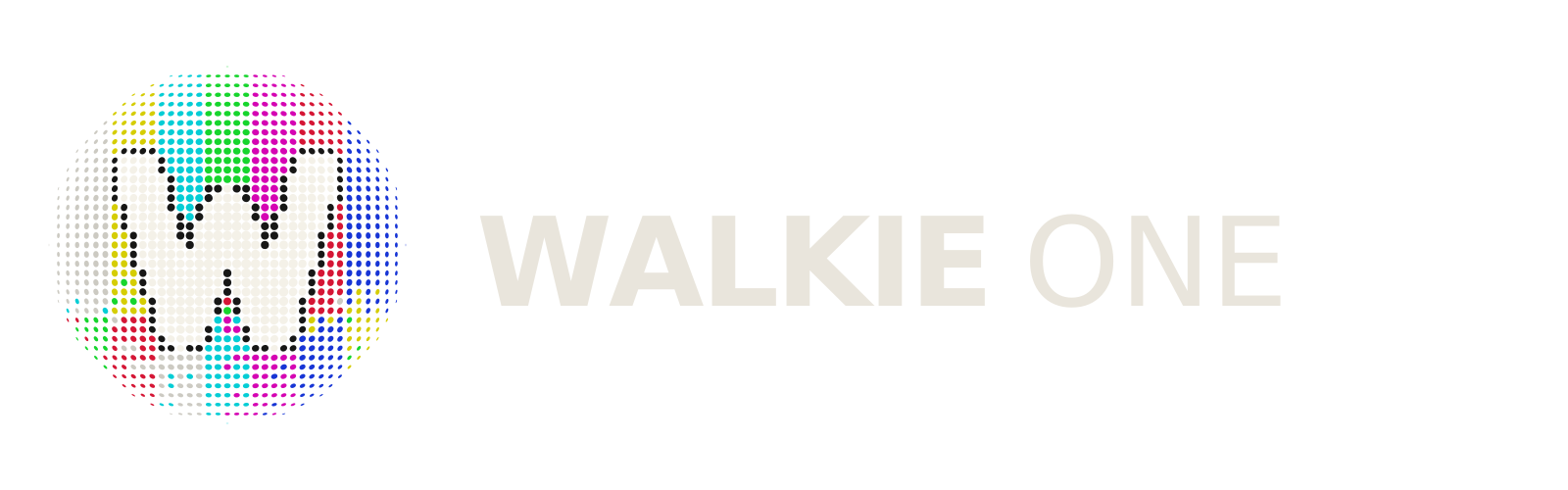
SOLID W / NEUTRAL BUFFER
Focused study / broadcast bars × native orb
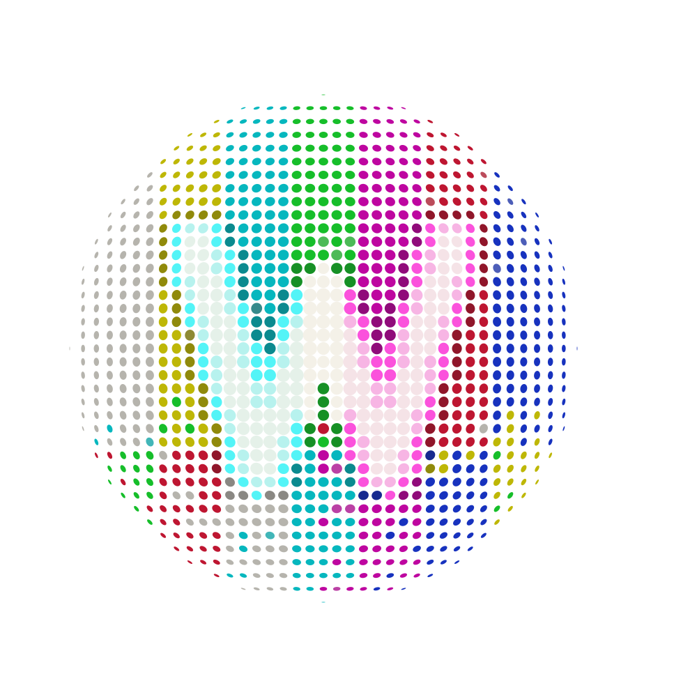
The broadcast bars stay constant. What changes is how the W participates: glowing above the signal, splitting at the edges, accepting colour, breaking into scanlines, or gaining a quiet halo.
Every version uses the exact winning orb geometry. The brighter W is the key correction from the earlier website treatment.
WHITE CORE / SOFT RGB EDGE
WHITE CORE / STRONG RGB FRINGE
CYAN / WHITE / MAGENTA
WHITE CORE / TWO COLOUR CUTS
BRIGHTENED BAR PENETRATION
WHITE W / DARK BUFFER
HORIZONTAL HIGH-GAIN BAND
WHITE W / COLOUR DROPOUTS
INTERLACED WHITE + BARS
MAXIMUM WHITE / SOFT FIELD
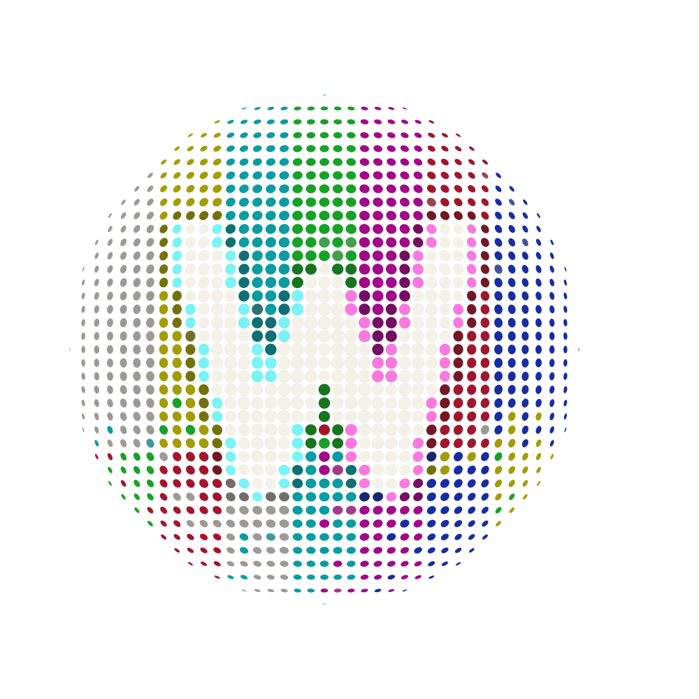
Broadcast experiments / editable vector
The first two translate the directions you liked into exact SVG artwork. The next five push the same idea through different kinds of signal distortion.
Nothing is masked with a bitmap: every coloured perforation is an individual editable vector ellipse, and the W’s shading structure remains intact.
Original direction / vector translation
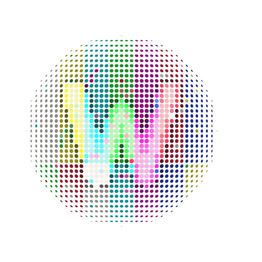
Original direction / vector translation
New vector evolution
New vector evolution
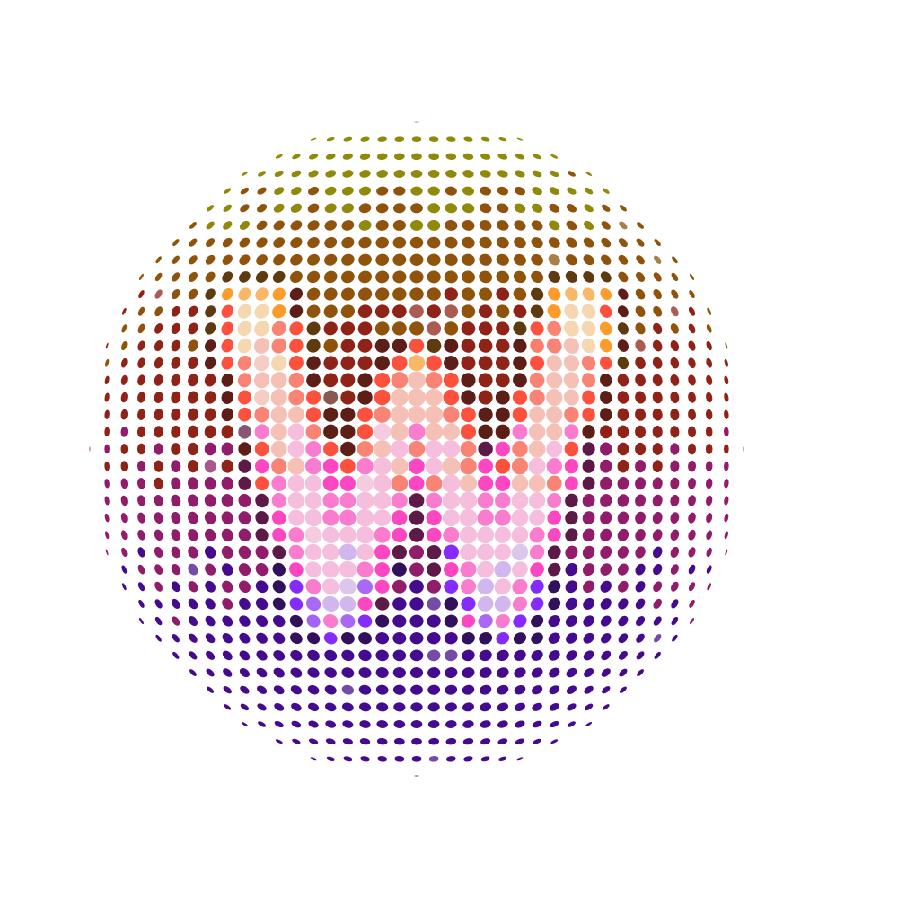
New vector evolution
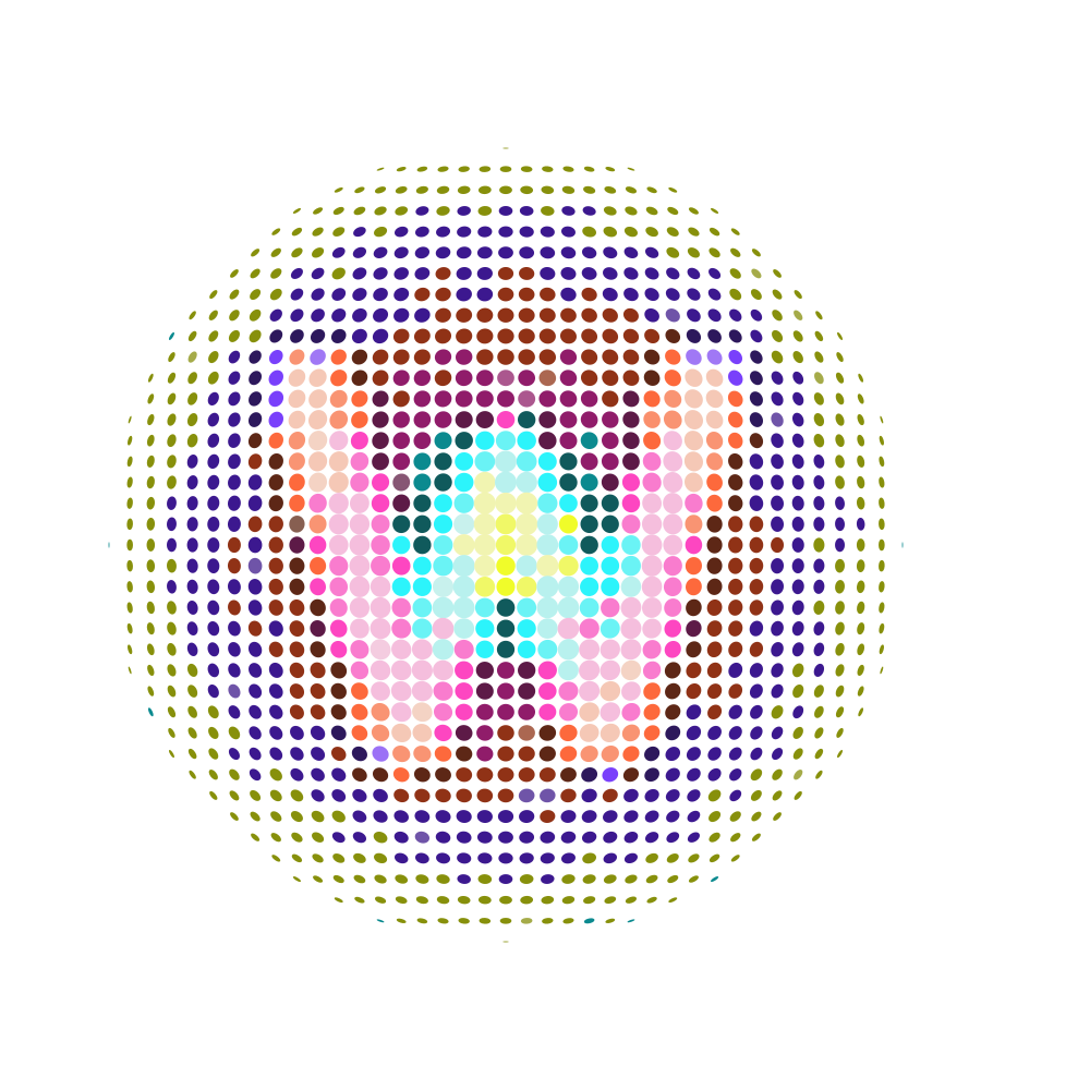
New vector evolution
New vector evolution
Digital signature / final orb
The Distinctive orb stands alone here. At browser-tab size, the perforations resolve into a textured sphere while the W remains legible.
 Walkie One — Final Mark & Colour Systems×

Extended palette / 10 systems
Each system is a complete six-tone treatment: five shades preserve the orb’s depth and W, while the sixth is optically chosen for the wordmark. Toggle the canvas above to see every reverse palette.
Fire, cast iron, and warm evening light.
#2D211C#4D3025#78513E#B88363#E0B593#F1D7C3Culinary, confident, and quietly luxurious.
#2A1B20#4B2731#784050#B36C7C#DCA4AF#F0CCD3Timeless hospitality with a brass-and-wood soul.
#232218#3B3A23#5E5B34#918A50#C1B874#E2DBADNatural, premium, and grounded without feeling rustic.
#17251C#263F30#41664E#74A084#A9C7B2#D3E3D8Technical clarity with an unmistakable communications cue.
#172338#263B5D#3F6092#7295C7#A7BFDE#D3DFF0Architectural metal, coastal air, and modern craft.
#142824#21443E#386D65#69A198#9BCBC4#CDE6E2Energetic and appetite-forward without becoming loud.
#2C2111#4A3516#755522#AA803A#D8B465#F1DAA3A sophisticated late-night dining expression.
#251927#3E2942#633F68#956B99#C2A1C5#E3D1E4Calm, contemporary, and broadly architectural.
#17242A#263E49#406370#7193A0#A4C1C9#D1E1E5Warm, human, and rooted in food and clay.
#2B1D1A#4A2E28#754A40#AA786B#D3A69D#EDD1CB